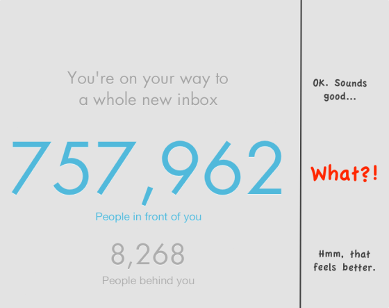
As a fan of GTD(Getting Things Done), a sufferer of email-overload and a User Interface enthusiast, when my friend Drew Wilken informed me of this new ‘email killer app’, I dropped everything on my hands and hit the ‘App Store’ icon on my iPhone5, and downloaded the highly hyped app. I gotta have it! One minute and 37 seconds later, I hit a cold hard wall looks like this:
Am I furious about this, you ask? For a second, yes, but when I look closer, my feeling toward the app quietly changed. Let me tell you what happened.
- Two sides of the same coin
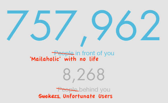
When I first launched the app, I was greeted with a big welcome screen tell me I can’t use the app just yet. I need to wait in line for the system to gradually rollout. And my position is displayed on screen with huge blue numbers: ‘757,962’. What? There are hundreds thousands of people before me? What a disappointment! Wait a second, what’s the smaller gray text beneath? ‘8268 behind me? Hmm… That feels better…’
I believe a lot of people share the similar feelings when getting in line for Mailbox’s developer Orchestra to slowly roll out the app. To ease the pain of waiting, the progress indicator in the waiting screen is carefully and cleverly designed. By showing both the people ahead of you and the people behind you, the design gives you a feel of where you are, but also a feel of how much you have progressed (though the smaller gray ‘People behind you’ number). Pain is more bearable when you know you’re not the only one that’s suffering.
- Joy of the flipping numbers
Another intriguing detail is when you leave the app for a while and come back, the two numbers will get updated accordingly, with a cool animation of flipping numbers you’ll usually see in a count-down clock. It really creates a feeling of ‘boost on progress’, which is kinda addicting. I found myself come back and check the app every 30 minutes or so just to see the numbers flipping. (‘I ascend!’) After the initial update, the number will still flip when it gets a new update, but much slower, leave people in the real waiting.
- Designed outlets for impatience
People get bored quickly when staring at slow turning numbers. Soon they want to do something to change the situation, or check something for distraction. This is where the well designed three ‘impatience outlets’ come into play. Beneath the numbers, three icons are displayed:
‘About’ will tell you what the app is about, why you need to wait.
‘Status’ links to an article on developer’s blog explaining in more details how the rollout is handled and how long should user expect to wait.
If you’re still unsatisfied, there’s the third icon ‘Discuss’ which will lead you to the Mailbox app’s Twitter accounts. You can vent or check other people’s vent (or success cheer). Spread the word while add to the hype. (Maybe this is why the app is so hyped)
- Yes. I dare to hope.
Now you see why I’m not furious at all. Actually I had more hope and confidence in the new app. If the designers in Orchestra would put so much thoughts into a simple waiting page to smooth out the launching process, it shouldn’t be hard to imagine the standard they’ll hold for the actual app. Now I’m really intrigued to see the app’s user experience. I’ll write another blog when my waiting is over. Stay tuned.
What’s your experience with the waiting or the app itself? Leave a comment and let me know!
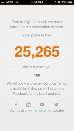
Edit: It seems good design tends to go viral. Hot calendar app Tempo also assume the similar reservation system and even UI after an initial crush by demand. Here:
Related articles
-
Mailbox Is The Best E-Mail App For Your iPhone, And It’s Available Now On The App Store (cultofmac.com)
-
The Mailbox Rollout: Perfection in Digital Era Marketing (markpalfreeman.wordpress.com)


