Facebook recently released their new design of the ‘News Feed’. From the announcement, even though they didn’t mention a word about ads, I still smelt it. All of the design changes in a large part are to make Ads count. Here’s why:
1. Bigger photo = Bigger canvas for Ads
The new design comes with bigger photos and albums to offer a more engaging and immersive experience. While user contents become more immersive and prominent, so do embedded ads. (Facebook already embedded ads into user Timeline)
[caption id=”attachment_1405” align=”aligncenter” width=”560”]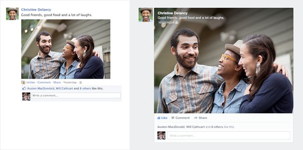 Image via: http://www.theatlanticwire.com[/caption]
Bigger canvas means a LOT for advertisers in that it blurs the lines of a banner and a real ad page. Facebook should be able to charge a higher CPM rate if it proves to be more efficient.
2. Less clutter leads to more focus, on both user content and ads.

Facebook’s current news feed feels cluttered. It easily triggers the ‘cognitive overload’ issue and a lot of the users just back away from it, or totally ignore the blob of ads on the right side of the page. With the design changes, there are less contents in one page, but they will get more attention and focus. Coupled with more compelling photos, even boring ads that no one wanted to station their eyeballs before will get some love with the new design now. Less really is more.
3. Better content curating can also mean better ads targeting.
Another big part of the design is better curating. Facebook promised to offer the best ‘personalized newspaper’. Every ‘Like’ or ‘Share’ you make on Facebook will all being monitored and analysed to further ‘fine tune’ content to your taste. Your timeline will then become more relevant and personalized. This all sounds fantastic on the surface, but wait! Ads will become more relevant and personalized too! This is not necessarily a bad thing though. With better targeted ads (and hopefully higher CPM rate), Facebook could actually afford to not bombarding ads to their user, and offer less intrusive experience.
Summary
Overall, I think designers in Facebook deserve some applause. They make the layout more streamlined, promoting ads without downgrading experience, and finally being consistent with their mobile experience. Like I pointed out in my another blog, done right, it could be a win-win to everybody.