A lot of people hate Apple Map. Bad directions, corrupted map data, police warnings, you name it. Yet most of the criticizes are pointing toward the back-end map data, not to the map user interface and user experience. Actually, no one seems to have talked about it. After a closer look, I found that Apple Map UI did one thing or two right:
1. Less clutter
The overall Apple Map layout is designed to avoid ‘cognitive overload’ as much as possible. Road names only get displayed when it helps the navigation, instead of throw all the names across the map.
Apple Map:

‘I-75’ is displayed because that’s the road on which the car was currently driving. ‘Akers Rd’ is displayed because it offers a reference point of where the car is at the moment.
There is no clutter here. The user can know where they are at a glance (Driving on I-75 near ‘Akers Rd’’.) . Minimum ‘eye-off-the-road’ time. Good for safety.
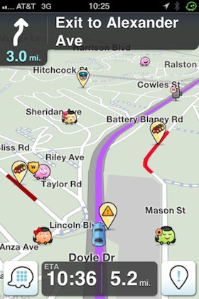
Waze and Google Maps:

Google Map
 Waze Navigation App
Road names are everywhere and random. The user needs good eyesight and extra time to figure out which road he is driving on and where exactly he is on that road. More ‘eye-off-the-road’ time. Bad for safety.
2. Clear information hierarchy with relevant information
The single most important part of a map navigation UI is the ‘Navigation Panel’ where all the navigation information is displayed. The most critical navigation questions we ask ourselves are:
-
‘What should I do on the next Turn?’ (Left, right, exit highway, etc.)
-
‘How far till I have to turn?’ (A number in miles or feet.)
-
‘Which sign should I look at?’ (The road or exit sign.)
Apple Map:
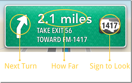
As we can see from above screenshot, the information is very clearly spelled out. User is able to get direction within 2-3 seconds.
Google Map:

All the information is on there, but they are all with same visual weight. User will have to read through the entire sentence to get what they need. They can’t skim, thus more time-consuming (5+ seconds).
3. Subtle color coding is intuitive
Apple Map:

Light Blue: Current route, Car Indicator (round badge), Next Turning Point
Green: Other reference road names.
Very easy to filter useful information. Blue = useful. Green: reference only.
Google and Waze Map:


No color coding on road or road names at all.
4. Lock-Screen peace of mind
Another thoughtful thing about Apple Map design is how navigation works with handset’s lock screen. When using the smartphone as GPS, battery life is always a concern. (You can’t expect people to always has a car charger around). When driving straight on a highway with the next turn is 100 miles away, there is no reason to keep the smartphone screen on all the time. But locking the screen risks missing the important exit (yes there’s always voice prompt, but we are driving at 70mph after all).

How Apple Map solves this problem is quite smart. When navigation is on, if you lock your iPhone, the navigation screen will get on the lock screen. So if you want to check how far you’re to the next exit, just push Home or Power key to turn the screen on, don’t even need to unlock the screen. Better yet, when you’re approaching the next turn, the lock screen will automatically lit up until you successfully make the next turn.
Summary:
Adding all these together, I found Apple Map still holds its high standard when it comes to user interface and user experience design. The map data may be screwed up, but the design is still killer.
Related articles
- Apple Maps Beats Google Maps and Waze in Navigation Test (iClarified.com)