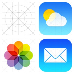
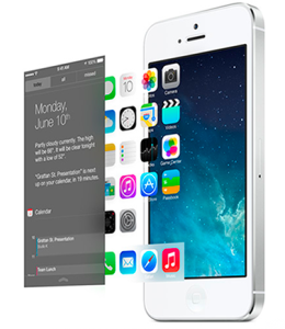
So the biggest announcement in tech industry is behind us. Yesterday in Apple’s WWDC 2013, the new iOS 7 was released to the public. My feeling towards it is a mixed bag. I liked the simplicity of the new design language, but not a big fan of the somewhat ‘childish’ app icon colors. I’m excited about the huge potential of iOS for cars (which deserve another blog), but not so keen on the Control Center. When all the excitement and disappointment quiet down, I tried to put all the pieces together and wonder what exactly Apple did on iOS 7?
Here is what I found out:
1. Stronger Design Rules
- Grid system: As Jonny Ive put it ‘Developing a grid system allowed us to achieve a much more harmonious relationship between individual elements’. A well designed and implemented grid system will hugely improve the inner relationship between scatter around UI elements, thus making them feel like part of a single piece. This is essential in ‘flat design’ that iOS is obviously influenced by. Not that iOS 6 is designed without a grid system, it’s just that the previous ‘skeumorphism’ UI style give ample affordance and visual clue, thus a grid system’s importance is not as critical as a simplicity centered flat design.
- Redesigned color palette: Anyone familiar the old iOS will find the new one way more colorful, to the extent of making some uncomfortable. These colors come from a re-designed palette that go well together. This actually reminds me of when iMac is first introduced to the market. The beautiful neon colors really capture a lot of attention. Some would say the new look of iOS is actually childish and will hurt its image of a professional device. I tend to disagree. There is nothing wrong about being colorful, being bold as long as it’s still well thought out and designed to please human eyes. iOS color has been dull for soooo long, and it’s time for a change.
- Dynamic UI that get out-of-the-way when not needed: Nothing can be said better than Apple’s own terms, and forgive my laziness of directly quoting them here: ‘The interface is purposely unobtrusive. Conspicuous ornamentation has been stripped away. Unnecessary bars and buttons have been removed. And in taking away design elements that don’t add value, suddenly there’s greater focus on what matters most: your content.’ Also a ‘flat’ UI make doing this easier, since all the elements are mostly colorful geometric shapes, it won’t hurt the snappiness of the UI as badly as a ‘unwieldy’ heavy textured UI.
2. Industrial Design and UI Design Integration
This has been criticized all along. People complained about the minimalist industrial design of iPhone doesn’t match the ‘skeumorphism’ style UI. Now it seems with the iOS 7, they are start to come to the same direction: Simplicity. One good example is the layered effect iOS 7 trying to create with the use of translucency. It might look very subtle, but it means a lot. It makes your iPhone felt more legit and physical, more ‘real’. In heart, the new iOS 7 is still trying to be ‘real’, but it has evolved from ‘visual skeumorphism’ to ‘psychology skeumorphism’. After all, Apple is all about making technology human. Or put it in their own words:
“Technology should never get in the way of humanity”
3. More Mobile Friendly
-
Conserving Power: A big development iOS 7 bring to the table is to conserve power usage when the app is not in the foreground. No other company came close to how deep Apple dig to save the 1 minute of battery power.
-
Flat Design uses less CPU power, thus smoother: I bet the new iOS 7’s built-in UI image resource size is much smaller than iOS 6. To put it in layman’s terms: It has become leaner and faster. Exactly what mobile demands.
4. Character?
This is a vague feeling of mine. I can’t really put my finger to it. But the bold color, the subtle translucent layers, the smart UI that will hide themselves when I need to view my content, the smarter and more human-sounding Siri, etc. all give me a feeling that iOS 7 somehow come to life, has its own character, and evolved to be smarter and prettier. There’s a slice of humanity in it, no matter how thin it is. Maybe it’s just me day dreaming, or maybe this is also Apple’s vision?
BTW, the Apple official iOS 7 Design page is by itself a design lesson, I recommend going through it. It’s not just a sales pitch.


